Smart Home Technology & AI
Brand Identity | User Experience | Art Direction
*NDA: UI/UX still under development - final brand identity including logo, visual assets and design systems are as yet unreleased to the public.
OVERVIEW & CHALLENGES:
The idea of an artificial intelligence (AI) at the core of Savant's home automation software has always been a goal of the company's founder. Knowing the challenges of competitors in the industry, the Savant team needed to create something different, while acknowledging that AI can be intimidating. It can evoke thoughts of intense security; a living, breathing computer brain that watches everything. However, knowing that this was a common perception, Savant aimed to create an AI experience re-crafted to become more human, relatable and friendly. It would be named Rosie, an old reference to the friendly robotic maid on the vintage animated series The Jetsons. The team's objectives included:
Aim to bring these human traits to a new AI brand, integrating everything from facial recognition and home network configuration to Savant’s home energy recommendations—emphasizing convenience, comfort and technology.
Ensuring the design conveys adaptability and creativity while maintaining simplicity and impact.
Creating a user experience that is engaging, accessible and provokes fun-
to-use moments that only add to making the home a more comfortable space.
to-use moments that only add to making the home a more comfortable space.
DESIGN SOLUTION:
As the acting art director, the task was to create a personality and brand identity for Rosie. Unique personality traits were created to make her an engaging addition to the Savant family. Rosie's chosen personality traits were:
DEPENDABLE: always at the ready, dependable, and attentive, but never stored in the Cloud
FRIENDLY: upbeat, positive, polite and direct
PREPARED: present, organized and cooperative
EFFICIENT: meticulously works in the background, helpful, consistent and straightforward
EFFECTIVE: gets the job done in the quickest possible manner, reactive and reliable
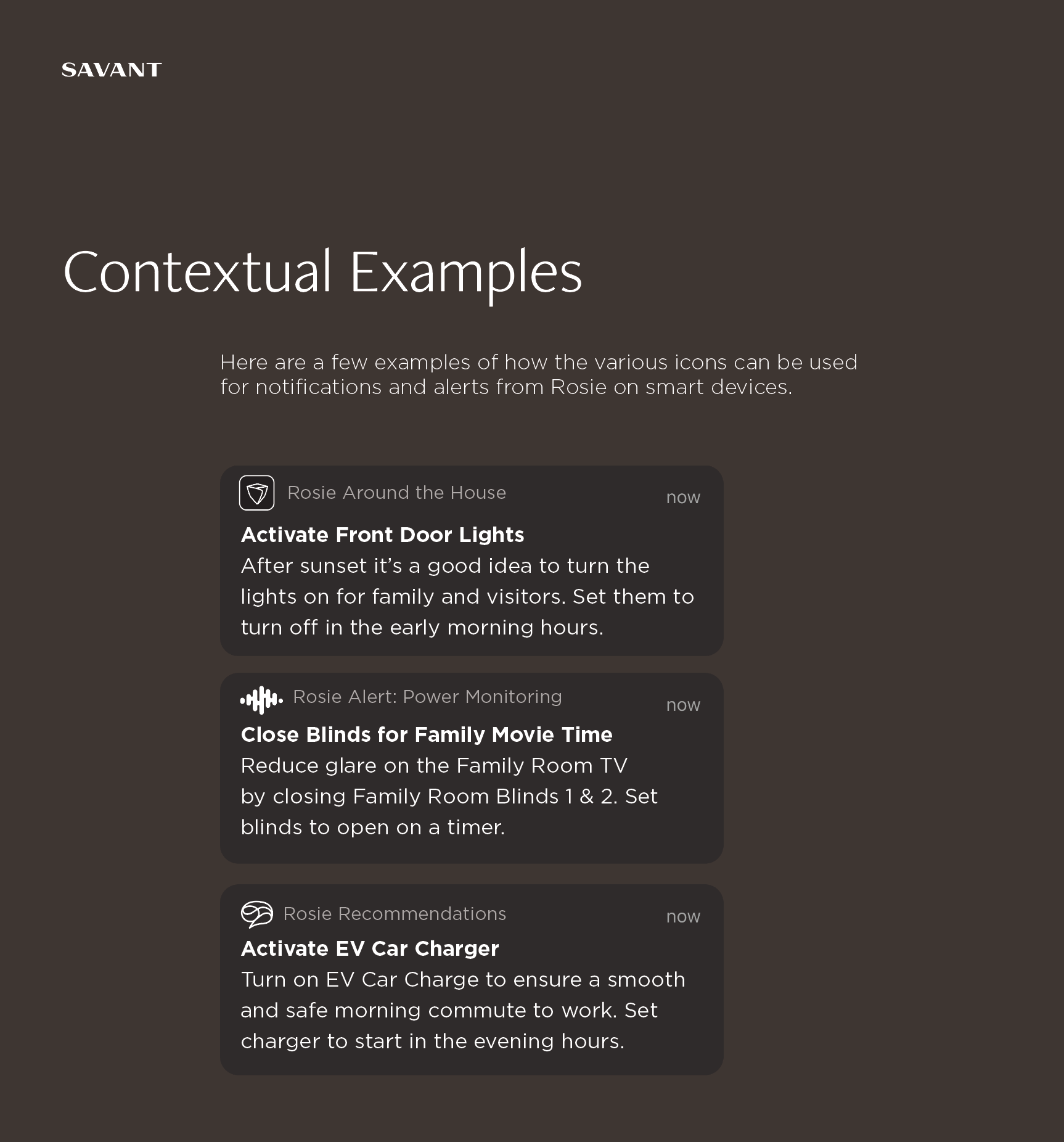
The brand identity exploration associated with Rosie revolved around something organic; a sound wave, a flower or a brain. These elements were strongest based on user feedback and design research. Users felt that icons related to these elements created a warmer tone, and a visual that was not directly related to smartphones or other household devices.
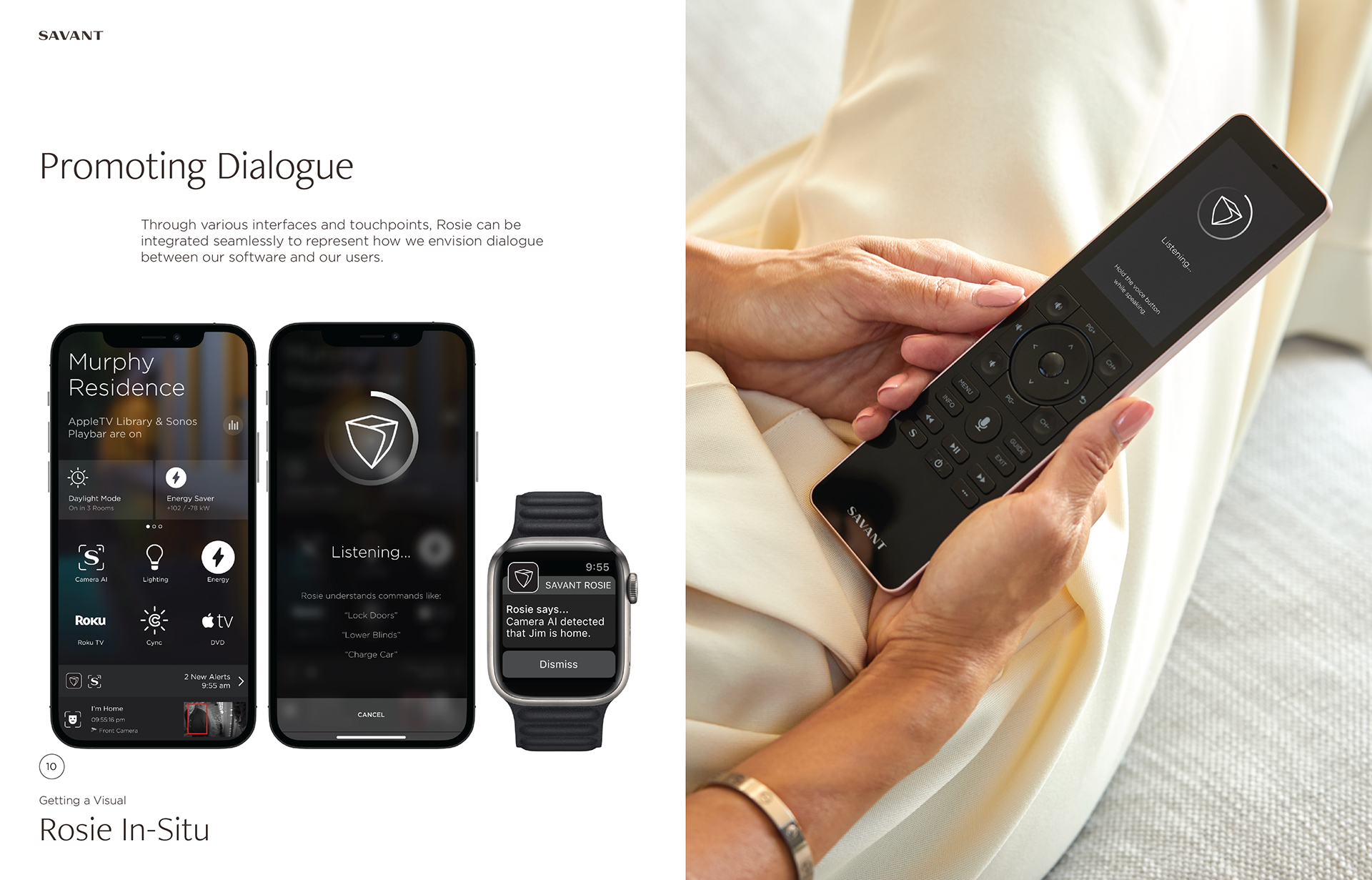
USER EXPERIENCE:
Rosie's initial interface design needed to be welcoming in its tone and messaging. "Rosie Around the House" or "Rosie Suggests" the relationship between a trustworthy housekeeper who is always aware and present when you need her. This messaging received the most traction amongst testing with users.